Click on images below to enlarge:
|
 |
|
|
|
|
| The Old Patent Building houses both the National Portrait Gallery and
the American Art Museum.
| An interesting tale about the renovations of the Old Patent Office and
the building's horrid condition prior to renovation.
|
Another sign revealed the Old Patent Office used to display diagrams and
models -- a testament to the physical nature of inventions back then.
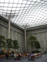
| The attractive, covered, central courtyard. I especially like the type
of trees.
Prior to this, in the exhibit on the building's renovation, I saw a
picture of the earlier courtyard: a lovely open-air space with large
spruce trees and lots of grass. I worried when I read that during the
renovations they paved and covered it. It turns out they did a nice job
and the space still looks good.
|
|
|
|
|
|
| A panoramic video of the courtyard.
| Another shot of the courtyard, taken on a different day. This day it
was perfectly silent, meditative.
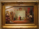
| Interior with Portraits by Thomas Le Clear, for my collection of
paintings of paintings, which also happens to be a painting of a
painting in progress.
| I always like Albert Bierstadt's non-religious paintings. This is
Among the Sierra Nevada, California.
|
|
|
|
|
|
| Interesting commentary on Bierstadt's personality and the reaction to
his work.
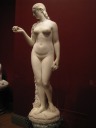
| Hiram Power's delicate Eve Tempted.
| I wonder how they pick the frame. This is Improvisation by
Childe Hassam.
| This could be me if I was a druid. It's Adams Memorial by
Augustus Saint-Gaudens.
|
|
|
|
|
|
| Wow, what a story about the previous sculpture.
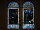
| This stained glass doesn't look particular exciting when viewed in this
two-dimensional picture; it looks more intriguing in person.
| The stained glass is in relief! As you can see from this side view,
some pieces bulge out significantly more than others. You can even
somewhat sense this from a distance.
| Details about the stained glass.
|
|
|
|
|
|
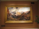
| Huge Thomas Oran painting one of three: The Chasm of the
Colorado. The plant at the right gives a sense of scale.
| Huge Thomas Oran painting two of three: The Grand Canyon of the
Yellowstone (1893-1901). The bear-skin sofa cover in the middle of
the room feels somehow appropriate for this setting.
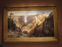
| Huge Thomas Oran painting three of three: The Grand Canyon of the
Yellowstone (1872). I think I like this painting the best because
of the sense of scale provided by the people.
| There's such detail in Jasper Cropsey's Greenwood Lake.
|
|
|
|
|
|
| Wayne Thiebaud's San Francisco West Side Ridge. Yep, definitely
San Francisco...
| In the folk art section, James Hampton should've been a cathedral
decorator. Instead, he spent 14 years making this low-budget (aluminum
foil) church chancel display. It's named The Throne of the Third
Heaven of the Nations' Millennium General Assembly.
|
There was a sizable display on the events surrounding the death of
Colonel Elmer Ellsworth, the first casualty of the Civil war. I learned
so much from the commentary by the objects, paintings, and photographs
that I felt like I was in the American History museum.
| Wow, she only permitted women who wouldn't distract anyone.
I
didn't bother photographing the portrait this plaque accompanies.
|
|
|
|
|
|
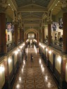
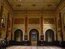
| Looking down the third floor exhibit hall from the third floor
mezzanine. On the mezzanine, there are paintings, banners, and
sculptures.
| A panorama, taken as a video due to the low light conditions, of the
third floor great hall. It's highly decorated: reliefs, stained glass,
tiled floor. It's too bad not many people go up to this floor and get
to see it.
| Two plaster casts of Abraham Lincoln, made a mere five years apart (1860
versus 1865). It's distressing how much the presidency aged him.
| Once I realized what this was, I laughed delightedly. It's by Mike
Wilkins, but I won't reveal the title because it would give it away.
Preamble
|
|
|
|
|
|
| James Buchanan / 1857-1861 and Abraham Lincoln / 1861-1865
by R. Luke DuBois: a simple, effective example of data visualization.
Read the next picture to understand what these are and how they work,
then flip back here to examine them closer.
| Explanation.
|
Paul Cadmus's series Aspects of Suburban Life (especially this
one on golf) shows crowded, rowdy scenes in which everyone does his
or her own thing. An interesting point.
|
The American Art Museum has the
same wooden bronze horse as Stanford's Museum.
|
|
|
|
|
|
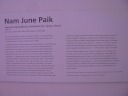
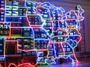
| A movie of the creative multi-video display that is Nam June Paik's
Electronic Superhighway. As you see, every state has one or more
television screens showing things associated with the states. An
interesting idea, and I guess something that can be used for a Game clue
(getting people to figure out what's being shown in various states).
| An explanation of the piece. Worth reading because it includes some
information I wouldn't have already noticed, such as about the screen
for Washington D.C.
|
A piece of art--in actuality a large poster-size diagram--showed the
companies involved in the Vatican banking scandal 1959-1982 and the
relationships between them. It felt like a newspaper's or prosecutor's
diagram, not something I expect to see in an art museum.
|
I kind of liked Ernie
Gehr's Surveillance, which somewhat captures the feel of
sitting in a park and watching the world go by.
|
|
|
|
|
| I'm enthralled by this display of lettertype, Lloyd Schermer's An
American Puzzle. Indeed, it could be a Game clue/puzzle.
| I like the funkiness of this mixed media display. It's Sculpture
Group Symbolizing World's Communication in the Atomic Age by Harry
Bertoia.
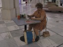
| Woman Eating by Duane Hanson is a detailed sculpture of a real
day in an unglamorous life.
|