Click on images below to enlarge:
|
 |
| En Route to the National Gallery
|
|
|
| I like the airy design of Washington's subway stations. The pattern is
good too.
| The capitol. Another picture one is required to take on a visit to
Washington.
|
|
| National Gallery of Art (West Building)
|
|
|
|
|
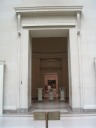
| An oblique shot of the entrance to the National Gallery of Art's West
Building. Tip your monitor!
| A quick panoramic video of the National Gallery of Art's west rotunda.
| A panoramic movie of a garden court. I like all the plants. Also, if
you listen with sound, you can hear water trickling.
Incidentally, the second garden court we visited had more flowers and
smelled nice.
| Look closely. See anything wrong?
Maybe you need to view the
full-sized image.
That's right, the pedestals have nothing on
them. In fact, with a simple black-and-white printout of a picture of
each item taped to each pedestal, it's almost as if the curator (or art
thief?) is mocking us.
|
|
|
|
|
|
|
Andrea
Solario's Lamentation does a good job of conveying sadness.
| Cardinal Bandinello Sauli, His Secretary, and Two Geographers by
Sebastiano del Piombo.
The Cardinal's robe flows amazingly realistically.
|
The
Feast of Herod and the Beheading of Saint John the Baptist by
Benozzo Gozzoli conveys quite a story. I never would've imagined
a painting that conveys all these things at once, but religious art
has unusual traditions.
| A 360-degree panoramic video of a room. The paintings here remind me of
Chinese scroll paintings but I'm guessing they're actually early Italian
works.
|
|
|
|
|
|
| Ruben's Daniel in the Lions' Den is a large and poignant
painting.
| Thomas Cole's Study for Catskill Creek.
I like Thomas
Cole, especially his paintings (like this) that lack religious
symbolism.
It's neat how the color of the wall matches the
painting. I wonder if it was planned.
| Johan Christian Dahl's View From Vaekero Near Christiania.
|
I like Claude
Lorrain's View of Tivoli at Sunset. This was in the special exhibit
on Claude Lorrain, which is why I didn't get to photograph it.
|
|
|
|
|
|
|
I wrote down that good commentary accompanied Claude
Lorrain's Landscape with Nymph and Satyr Dancing. Sadly, I
can't find the commentary online.
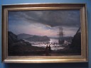
| Frederic Edwin Church's El Rio de Luz.
| Turner's Mortlake Terrace.
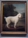
| George Stubbs's White Poodle in a Punt does an excellent job of
representing the dog's frizzy fur.
|
|
|
|
| Map of Ancient Rome, published by Étienne Dupérac and Giovanni
Giacomo de Rossi in the 16th century. It's more detailed than modern
maps! (View it full-sized.) Part of the National Gallery's Fabulous Journeys
and Faraway Places: Travels on Paper,
| The underground tunnel between the East and West buildings of the
National Gallery of Art. This is the part of the National Gallery that
I remember the most from when I was a kid. I remember sitting at
the cafe; I remember the moving sidewalk; most of all, I remember the
angled waterfall and the vertically flowing air right in front of it.
It's odd what sticks in one's mind.
Incidentally, the moving sidewalk bounces a lot when one walks on it.
It's springy. (I didn't remember this fact.)
|
|
| National Gallery of Art (East Building)
|
|
|
|
|
The fountain and glass pyramids between the West Building, shown here,
and the East Building.
Given that it was taken through a window, this picture is better than
one would expect.
| Objectivity by Sol LeWitt. This piece of art is somewhat three
dimensional, with the squares in each row becoming more recessed into
the frame than the squares in the row above. Thus, the piece raises
many questions such as whether any projection or mostly flattened or
shrunk representation of a real world scene can be said to be an
objective or realistic rendering of that scene.
| Robert Morris's Untitled (1976). Made of felt, the way it
naturally hung and folded made me think of giant origami.
Incidentally, most art critics talk about how this piece takes a
different form each place it's installed.
| Mel Bochner's Theory of Boundaries. I took this picture because
I thought the words in the boxes were interesting, like there was a
relationship between the words and the enclosing square, and because it
therefore could be inspiration for a Game clue. Indeed, I later learned
there is such a logical
relationship (see the second paragraph).
Incidentally, Mel
Bochner has done other neat, thought provoking work as well.
|
|
|
|
|
|
Alexander Calder made a mobile of a face that used one continuous
piece of wire. (Think about drawing a face without lifting your pen.)
Pretty amazing. The shadow is like the line drawing another artist
could've done.
I didn't take a photo because it couldn't convey
the impression of the mobile.
|
Calder's Little
Spider is well balanced: the fins rotate easily (and shift
colors due to changing angles as they do). The legs also look
balanced well. J likes this piece.
|
Calder's Funny
Fish, which uses colored glass, is an atypical piece for him.
It's too bad the National Gallery photo doesn't have any shadows--they
look better than the piece itself.
| Ad Reinhardt's Untitled (1947).
|
|
|
|
|
|
| Louise Bourgeois's Untitled (1952) reminds me of the stone towers
one finds on California beaches. While these admittedly are taller than
any I've seen in California, they're actually less impressive. First,
Bourgeois cheated by using a metal rod to align and balance everything.
Second, all the stones are similar in size. The stones in towers in
California usually vary wildly in size, yielding an interesting,
delicate, and precarious tower.
| Ellsworth Kelly's multi-story Color Panels for a Large Wall. By
being visible throughout the atrium, it constantly reminds the viewer of
the East Building's focus on modern art.
| Alberto Giacometti's The City Square, taken as part of my series
of photographs of sculptures of tall thin people (e.g., 1,
2).
| Another Sol LeWitt: Wall Drawing No. 681 C. I love the feel of
the colors. The next image explains how it was made.
|
|
|
|
| A description of how Sol LeWitt's wall drawing was created. I like
conceptual art's philosophy that the idea is paramount. I'm
disappointed, however, by this description because it doesn't state how
precisely LeWitt specified the colors. Did he specify the colors to be
mixed? Did he specify the ratios? Did he specify how the final color
should look? Judging from the one page diagram,
he only specified colors in broad strokes such as "RRBB," which I assume
means mix two different colors of red with two different colors of
blue. The particular shades appear unelaborated.
|
The special
exhibit on
Jasper Johns showed a neat painting: Out
the Window. Looks Game-clue like, though I'm not sure how it would work.
|